
Shopify layout shift: the 3 fixes that move the needle
The page jumps as someone reaches for Add to Cart and they tap the wrong thing. Three causes explain nearly all Shopify CLS, and why your lab score is understating it.
Ashraful
Shopify Select Partner
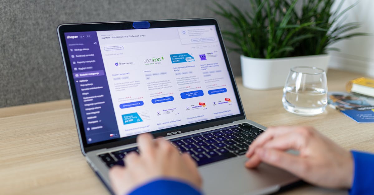
You know the feeling. You go to tap Add to Cart, an image finishes loading above it, everything shifts down, and you tap a size swatch instead.
That is Cumulative Layout Shift. Google measures it, it is one of the three Core Web Vitals, and unlike most performance metrics it has a direct and obvious link to whether someone completes a purchase. A customer who taps the wrong thing at the moment of buying does not always try again.
The threshold is CLS under 0.1. Most Shopify stores we audit are between 0.15 and 0.4. Three causes account for nearly all of it.
1. Images without dimensions
The biggest cause, and the easiest to fix.
When a browser meets an image with no stated size, it does not know how much room to leave. So it leaves none, lays out everything below, then the image arrives and shoves it all down.
<!-- browser has no idea how tall this will be -->
<img src="{{ product.featured_image | image_url: width: 800 }}">

<!-- browser reserves the exact space before the file arrives -->
<img src="{{ product.featured_image | image_url: width: 800 }}"
     width="{{ product.featured_image.width }}"
     height="{{ product.featured_image.height }}"
     alt="{{ product.featured_image.alt | escape }}">
The width and height attributes are not about display size; your CSS still controls that. They give the browser the aspect ratio so it can hold the space. Modern browsers combine them with max-width: 100% to reserve the right area at any screen size.
Every image on the page needs this. Product images, collection thumbnails, logos, badges, blog covers. The ones people miss are the small ones, and a row of six 40px payment icons with no dimensions still moves the page.
Worth: usually the majority of your CLS. On stores where this was the only problem we have gone from 0.3 to under 0.05 with nothing else changed.
2. Web fonts swapping
Your page renders in a fallback font, the web font arrives, and every line of text re-renders at a slightly different width. Headings rewrap, paragraphs change height, everything below moves.
Three things fix most of it.
Preload the font your first screen uses:
<link rel="preload" as="font" type="font/woff2" crossorigin
      href="{{ 'YourFont.woff2' | asset_url }}">
Use font-display: swap so text is readable immediately rather than invisible while the font loads. Invisible text is a worse experience than a swap, and Lighthouse penalises it separately.
Match your fallback's metrics. This is the part people skip and it does most of the work. If your web font and your fallback have different character widths, the swap moves everything. size-adjust lets you tune the fallback so the two occupy nearly identical space:
@font-face {
  font-family: 'Fallback';
  src: local('Arial');
  size-adjust: 105%;
  ascent-override: 90%;
}
Getting those numbers right is fiddly. Getting them approximately right removes most of the shift.
Worth: moderate on most stores, large on any store using a display font for headings.
3. Things injected after load
Apps and banners that appear once the page is already rendered and push content down.
The usual suspects: cookie consent bars, announcement bars, free shipping thresholds, review star ratings that arrive after the product title, currency selectors, and popups that reserve no space.
Two ways to deal with each one.
Reserve the space in advance. If your announcement bar is always 44px tall, give it a 44px container in the HTML so the content below never moves:
<div class="announcement-bar" style="min-height: 44px">
  {%- render 'announcement' -%}
</div>
Take it out of flow. If it genuinely cannot have a known height, position it absolutely or fixed so it overlays rather than pushes.
Review widgets are the common offender on product pages. The star rating appears next to the title after an API call, and the entire page below the title jumps. If your review app supports a placeholder, use it. If not, wrap it in a container with a min-height matching the rendered widget.
Worth: varies hugely. On a store with three injected elements it can be most of the score.
How to measure it properly
Lab numbers underreport CLS badly, and this catches people out.
Lighthouse in DevTools loads the page once and does not scroll. Most layout shift happens during scrolling, when lazy-loaded images arrive. A store showing 0.05 in Lighthouse can be at 0.25 for real users.
Trust field data. Search Console's Core Web Vitals report uses real Chrome users on your actual store. That is the number Google acts on. PageSpeed Insights shows the same field data at the top when it has enough traffic.
To find shifts yourself: DevTools, Performance panel, tick Screenshots, record, reload, then scroll the whole page. Layout shifts appear in the Experience track and you can click each one to see which element moved.
Do this on a phone-sized viewport. CLS is consistently worse on mobile, where everything is stacked in one column and any shift pushes the whole page.
What not to bother with
Chasing 0.00. Under 0.1 is the threshold. The difference between 0.05 and 0.02 is not worth a day of work.
A CLS-fixing app. Same argument as every speed app: it loads a script to fix a problem that is a static change to your theme. Reserving space is HTML, not JavaScript.
Fixing shifts nobody sees. A shift in your footer, after the customer has already scrolled past, counts toward the metric but not toward the experience. Fix the ones on the first screen and around the buy button first.
The order that works
- Add
widthandheightto every image. Usually most of the problem. - Reserve space for anything that injects after load, especially review widgets and banners.
- Preload the heading font and tune the fallback metrics.
- Re-measure with field data, not lab data, and give it 28 days to update.
None of this needs a rebuild. It is attributes and containers, and once it is done it stays done.
We fix CLS as part of Shopify speed work, quoted fixed price with a Lighthouse 90+ guarantee and a 14 day re-test. It normally ships inside a week without touching your design.
The free store audit reports your real CLS from field data and names the elements causing it. Or book a 30 minute call and we will look at your product page together.
About the author
Ashraful
Shopify Select Partner, Top Rated Plus on Upwork. 700+ Shopify projects shipped over 7+ years: themes, apps, migrations, speed, Hydrogen. Solo shop, no agency middlemen.
Read the full storyWorking on a Shopify project?
That's what I do every day. Pick whichever feels lower-friction.
More from the blog
Keep reading
The one line that cuts 800ms off most Shopify stores
Your biggest image is queued behind analytics and app scripts. One preload line in the head fixes it, and three rules decide whether it helps or backfires.
Read
Your Shopify store has a script budget and you are over it
Nobody decides to make their store slow. It happens one reasonable app at a time. Set the budget, run the audit, and get paid for it in returned subscriptions.
Read
Getting to Lighthouse 90+ on Shopify without a rebuild
Mid-50s to over 90 on mobile without touching the design. The five steps in order, what each is worth, and the three cases where a rebuild genuinely is the answer.
Read